















01 · Brand Refresh
Altus Brand Refresh
Introducing the new Altus identity
Scroll to begin
It’s time for a change.
Starting with a departure from red towards a familiar symbol with a unique distinction that leads into a forward peak for a harmonious wordmark.
Custom vector glyphs arranged on an 8-point grid system convey simplicity, strength, clarity, and harmony.
Oblong spines on the U and S create a wider, non-circular stance to counterbalance the forward-leaning A while their bowls slightly overshoot the x-height for perceived optical accuracy.
Unified stem widths with subtle 1x, 2x, and .5x corner radius bind the collection of glyphs and soften harsh angles for a friendlier tone.
The A’s apex rises above the ascender cap line as a nod to Altus’ ‘elevated’ root meaning.
The forward-leaning diagonal stroke indicates progress, motion, and upward momentum that carries the eye through the rest of the wordmark.
Perfect 45°, 90°, and 135° angles mimic common architectural junctions.
The forward-leaning ascender angle aligns with the A’s vertical stem to complete the A’s crossbar for legibility while still establishing a clear visual separation.
The cross represents a nod to the traditional medical cross symbol that conveys our healthcare focus, with careful consideration not to imitate actual medical or emergency services.
The cross defines the baseline 8-point grid system used throughout the stem widths, negative spacing, wordmark framing, and the entire Harmony Design System.
The cross also provides a juxtaposed color contrast that both binds the wordmark and stands alone as another uniquely identifiable mark exclusive to Altus.
Lockups
02 Lockups
03 Design System
Harmony
A collection of guidelines, standards, and reusable components that keeps every Altus touchpoint on brand.
Color
Every hue sits on an 8-point wheel, from brand teal to the neutrals that carry it.
Typography
Four typefaces, each chosen to echo the forward lean of the wordmark.
Iconography
Vector icons on a 24 by 24 grid, always square, always divisible by 4.
Illustration
Raw, mid-flight sketches that read like an expert's first thoughts on paper.
Pattern
The cross, repeated: a quiet backdrop that rewards a second look.
Voice & Tone
A two-axis map for how we sound, from serious to lighthearted and concise to detailed.
04 Harmony Colors
Brand Color
Using the Hue, Saturation, Lightness (HSL) model, each color hue is divisible by 8 on a 360° color wheel.
Neutral Colors
Subtle tones of blue and teal are injected into the grey colors for cooler, bolder tones that complement the broader color palette.
Primary Colors
Colors, named after health and wellness attributes, punch through conventional norms with bold, bright energy that reflects evolution of Altus.
Alpha Channels
Alpha channels on the 8-point scale can be mixed and layered to create dynamic color palettes for both light and dark mode application.
- Black72483216842
- White72483216842
- Heal72483216842
- Pulse72483216842
- Care72483216842
- Radiance72483216842
- Vitality72483216842
- Wellness72483216842
- Serenity72483216842
- Slate72483216842
- Tranquility72483216842
- Heal72483216842
- Pulse72483216842
- Care72483216842
- Radiance72483216842
- Vitality72483216842
- Wellness72483216842
- Serenity72483216842
Gradients
Mixing primary color hues creates endless gradient opportunities for vibrant, complex visual interest.
Works in the tools we use
- Revit
- Bluebeam
- Office 365
- Windows
- macOS
- Android
- iOS
Colors were refined on multiple operating systems, devices, and software applications to ensure uniform consistency.
05 Harmony Typography
Archivo
The primary typeface used throughout Altus brand collateral, picked because of its similarity to the Altus wordmark.
Archivo Narrow
A narrower version of the primary typeface used to fit more copy in a tight space, like resume project lists, footer copy, legalese, and other text-heavy constrained spaces.
Chivo Mono
A monospaced typeface used when each letter should fill the same horizontal width, like itemized price lists, mathematical or scientific notation, technical docs, and comparing tabular data.

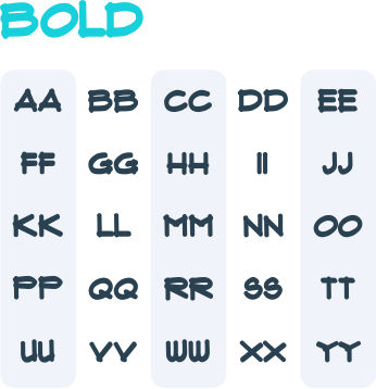
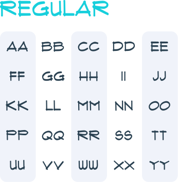
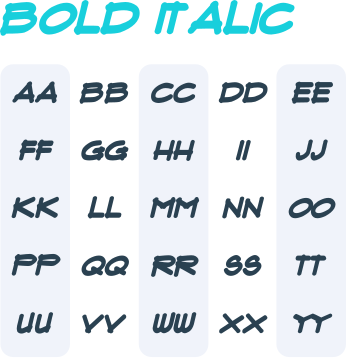
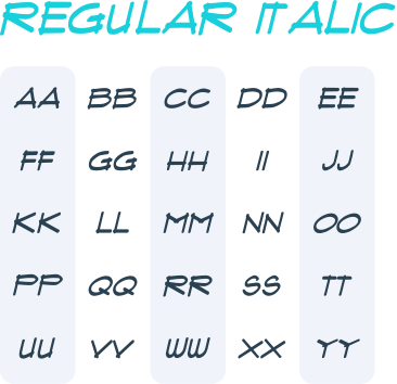
A handwritten typeface used to convey the spoken voice of Altus, like thought bubbles, tool tips, sticky notes, ancillary asides, and other sketch-style notation.
Archivo + Narrow
Archivo and Archivo Narrow were chosen to reinforce a clean, aesthetically simple font commonly associated with architecture while introducing a slightly sophisticated flare more characteristic amongst modern typography.
Slight forward leaning angles in the glyphs match the forward leaning Altus “A,” while more unique characters like the lower-case ‘g’ and ‘a’ represent a nod to a classic, retro style. The wide stance, squared tittle dots, and oblong shape of the circular ‘c, e, o, p, q, s, and u’ glyphs mimic the spine curvature in the Altus wordmark, while variable font-weights ensure a wide variety of contrasting pairs.
Chivo Mono
Created by the same team behind Archivo, Chivo Mono is a monospaced typeface chosen to complement the primary typeface with identical forward leaning glyphs, unique characters, and squared, bold terminals.
The script typeface was chosen to mimic an architect’s penmanship with clear, uppercase glyphs and overlapping terminals similar to handwritten blueprint notes and technical sketches.
All 4 Harmony typefaces are
Legible
Clearly translates across web, print, and mobile.
Symbolic
Complements and embodies the Altus identity.
Original
Avoids imitation as distinctly unique to Altus.
Versatile
Provides a range of styles for visual diversity.
Convenient
Commercially free and easy to implement.

06 Harmony Additions
Iconography
Scalable Vector Graphics (SVGs) are used in place of raster images. Icon sizes are designed on a 24×24 grid, always square, and always sized to be divisible by 4.
- 16
- 24
- 32
- 48
Illustration
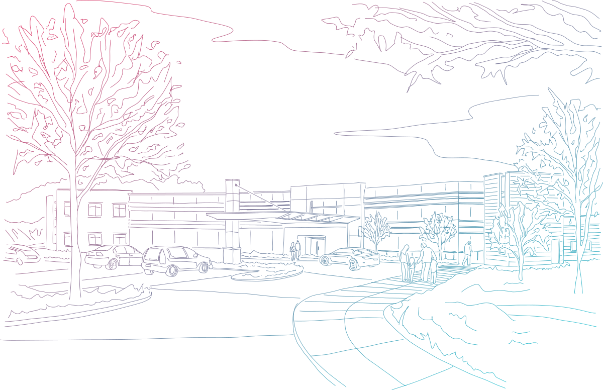
In contrast to the stark, bold lines in the Altus wordmark, illustrations stand out as thoughts in mid-flight, reflecting the speed and precision of an expert craftsman brainstorming ideas on paper. While never messy or sloppy, illustrations are intentionally imperfect, raw, and spontaneous.
Pattern
Repeating cross icons can be used to create subtle backdrops, watermarks, and subliminal brand imagery, especially when combined with professional photography.
Voice & Tone
Framework used to define how Altus communicates across different types of content to ensure consistency in messaging.
Mockups
07 Mockups
01 / 15 · Plan tube
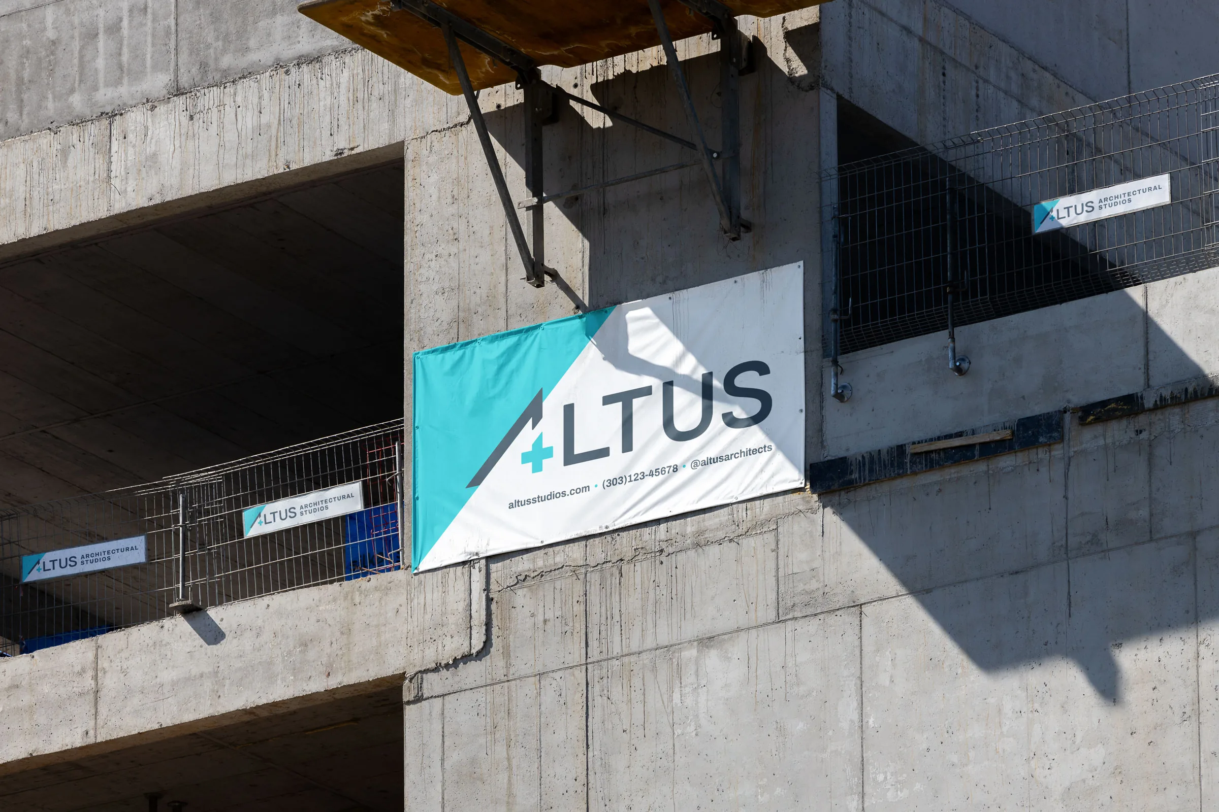
02 / 15 · Site banner
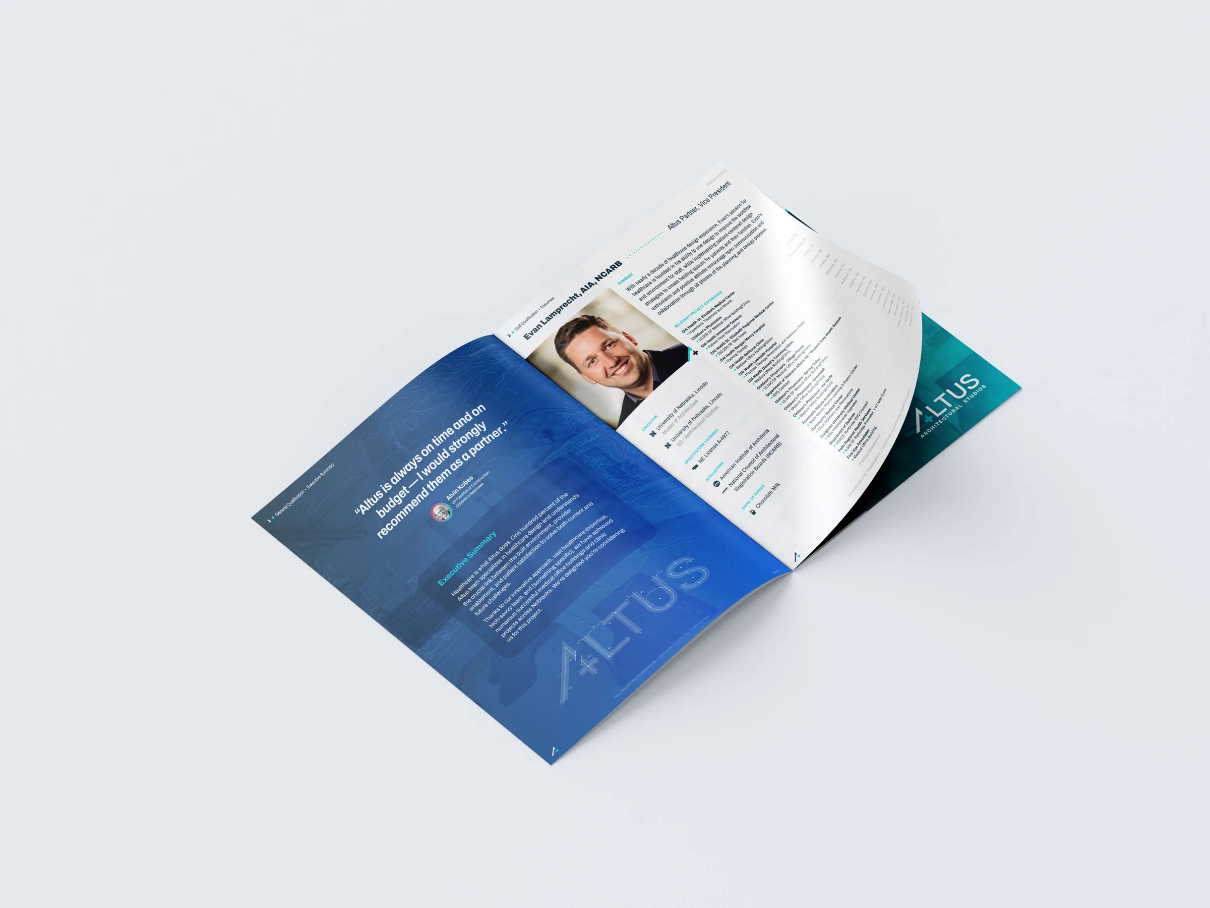
03 / 15 · Brochure
04 / 15 · Wall logo
05 / 15 · App icon
06 / 15 · Glass plaque
07 / 15 · Mug
08 / 15 · Window vinyl
09 / 15 · Hard hat
10 / 15 · Mouse pad
11 / 15 · Stamp
12 / 15 · Embroidery
13 / 15 · Polo
14 / 15 · Golf ball
15 / 15 · Billboard

